Your business card should open the door to start a conversation. Generic designs or templates from Vista Print are not ok. When you hand someone a card they should be wowed. You are saying this is me, this is us, who we are and what we do. It should be a statement that they won’t forget. Most people just leave them on a table to throw them away. You want a card that people will make sure to keep and not forget.
People often think they want to save money so they choose the cheapest option but that just leads to a total waste of money. The cheapest option means 99% of cards given out will meet the trash can.
Font Choice
Aside from the general disdain for fonts like Comic Sans and Papyrus on business cards, most people outside the graphic design community don’t really think about fonts and typeface.
One of the most basic decisions is whether you want to use serif or sans-serif fonts. Typically, sans-serif fonts are used for titles and headers while serif fonts are for bodies of text.
You can stick with this convention, but no matter what you decide, don’t choose two different fonts of the same type. For instance, you probably would not want your name in Times New Roman and your other information in Georgia. This creates a cluttered effect, which would have a negative impact on the reader. Stick with one font or use pairs appropriately.
When choosing a typeface, make sure it can be easily read. Think about spacing—between letters, words, and lines. Proper spacing allows your brain to process the words faster. One tip is to make sure the line height is larger than the point size of the font.
On a more subjective level, it’s important to consider what your goal is. What mood do you want to communicate? How aggressively do you want to convert the recipient? The answer to these question can guide the aesthetics of your business cards.
With so many fonts to choose from, you might have to try several before you land on the right one. One trick for picking a font is to type out certain characteristics you think the font might possess in that specific font. (Is it fun, energetic, tense, etc.?)
Seeing the words in the font they potentially correspond with will help you determine if it’s a good match. Also, consider if you can identify the opposite mood of the font. If you can’t, that probably means you can pick a better option.
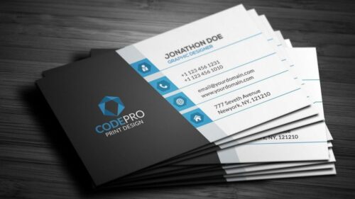
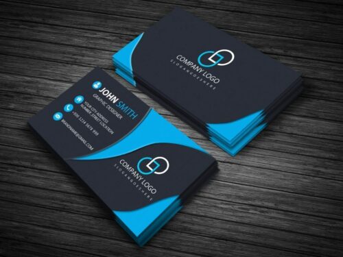
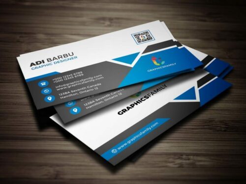
White Space/Negative Space
White space (also known as negative space) is a critical business card design concept that few business owners seem to understand. When we mentioned spacing between words and lines earlier, we were referring to micro white space, in contrast to macro white space, which involves the larger, empty areas of design.
Both are extremely important and neither should be overlooked. Just because you have space doesn’t mean you should fill it up. It may leave recipients overwhelmed and confused about what they should be looking at.
Another thing to consider is that more white space is generally associated with sophistication while less white space is often associated with “cheap” design. This helps explain why so many business cards take a purposefully minimalist approach.
White space can also help you highlight the important parts of the card. Calculated spacing allows you to choose which elements to highlight, and which ones to keep in the background.
The Psychology Of Color
Nothing makes a design pop like color, so how can you implement color psychology into your choices to make a statement? The most basic route is incorporating colors from your logo (which will most likely be on your card).
Sometimes, you’re not necessarily married to the specific colors on your logos. In these cases it’s still helpful to stick to a specific palette.
Before making your decision, think about how colors are interpreted.
What are your brand’s values, and how do they correspond with the emotional impact of different colors? To get an even more in-depth look at how colors can impact design, check out the article 19th-Century Insight into the Psychology of Color and Emotion.
Consider these elements, but also remember colors can mean more than these traditional ideas of symbolism in business card. Also try to consider the significance of colors in the context of your market. Re-branding a color itself is always possible, but still try to put some reasoning into why you chose a specific color.
Business Card Shapes
Non-standard shapes for business cards may give your brand another way to stand out.
The shape of your business card should complement your brand. The usual rectangle business card shape is a standard for a reason. It fits neatly into wallets, Rolodex spindles, and card trays, and is universally recognized for what it is.
But there are brands which are better served if their business cards are in an unusual shape. Given the right context, shapes can convey different emotions, just like colors. Circles or rounded shapes can project a positive emotional message such as friendship, love or unity. Squares and rectangles suggest stability, strength, professionalism, and efficiency.
When someone hands we a card that wows me, I take the time to place it in my wallet to keep it as I treasure the awesome business card. Something about the great quality and design makes me WANT to keep it.
 Call Us